<!DOCTYPE html>
<html lang=”en”>
<head>
<meta charset=”utf-8” />
<meta name=”viewport” content=”width=device-width, initial-scale=1, shrink-to-fit=no” />
<meta name=”description” content=”” />
<meta name=”author” content=”” />
<title>Hivebit Documentation v1.0</title>
<link href=”documentation.css” rel=”stylesheet” />
</head>
Hivebit
Introduction
- Getting Started
- SASS
- Stylesheet
- Javascipts
HTML Structure
- Search Form
- Header Logo
- Primary Menu
- Icon Menu
- Hero Section
- Achivement Item
- About Thumbnail
- Checklist
- Author Card
- Icon Box
- Left Icon Box
- Image Box
- Pricing
- Call to Action
- Member
- Blog
- Footer Widget
- Scroll to Top
- Contact Info
- Partner Silder
- Testimonial
Other Information
- Changelog
- References
- Customer Support
<!– left-panel –>
Hivebit Documentation v1.0
Thank you so much for purchasing our template. If you have any questions that are beyond the scope of this help file, please feel free to email us at codeblowing@gmail.com or
submit a comment in the product page. Thanks so much!
Introduction
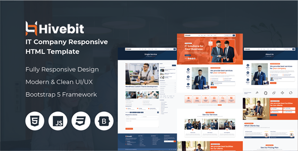
Hivebit is a modern, sleek, and fully responsive HTML template designed specifically for IT companies, tech startups, software development firms, and digital agencies. Whether you’re showcasing your services, portfolio, or team, Hivebit provides a professional and visually appealing platform to engage your audience and grow your business.
Template Information
| Title | Description |
|---|---|
| Template Name: | Hivebit – IT Solutions and Services HTML Template |
| Version: | 1.0.0 |
| Author: | Code Blowing |
| Create Date: | 01 February 2025 |
| Last Update Date: | 01 February 2025 |
Getting Started
This part of the doc will help you to quick start your project and will give you a basic idea about how Hivebit work. For you to get start open the “template-files” folder in Template Files/ of your download package.
What’s In The Box
Once you have download the package you will see the following folder structure inside template-files/ folder .
| Folder or File | Description |
|---|---|
| css/ | All CSS files inside this folder are used for styling the website, defining layouts, colors, fonts, and other visual elements to ensure a consistent and appealing design across all pages. |
| img/ | The images used in the demo and preview pages are for illustrative purposes only and may not be included in the final product. |
| js/ | All JavaScript files inside this folder are used for various functionalities, including handling user interactions, managing dynamic content updates, and enhancing the overall user experience. |
| sass/ | All Sass files inside this folder are used for styling the project. They contain variables, mixins, functions, and styles that help maintain a structured and reusable codebase. |
SASS
Before running grunt first you must check if you have sass installed in your machine. You can verify that sass is already installed by running the command.
$ sass --version
<!– pre-wrapper –>
If version appear, it means sass already installed in your machine and proceed to the next topic, otherwise follow the instructions below on installing sass.
Installing SASS
Windows
Before you start using Sass you will need to install Ruby. The fastest way to get Ruby on your Windows computer is to use Ruby Installer. It’s a single-click installer that will
get everything set up for you super fast.
Mac
If you prefer the command line over an application then getting Sass set up is a fairly quick process. Sass has a Ruby dependency but if you’re using a Mac, congratulations, Ruby comes pre-installed.
Install SASS
Ruby uses Gems to manage its various packages of code like Sass. In your open terminal or cmd window:
$ gem install sass
<!– pre-wrapper –>
You should now have Sass installed, but it never hurts to double-check.
$ sass --version
<!– pre-wrapper –>
Online Reference: http://sass-lang.com/install
Stylesheet
We use SASS in creating styles in this template logically grouping into sections. Below are the structure of sass files and folders
<link rel="stylesheet" href="css/bootstrap.min.css">
<link rel="stylesheet" href="css/all.min.css">
<link rel="stylesheet" href="css/meanmenu.min.css">
<link rel="stylesheet" href="css/animate.css">
<link rel="stylesheet" href="css/lightbox.min.css">
<link rel="stylesheet" href="style.css">
| File | Description |
|---|---|
| bootstrap.min.css | Core Bootstrap css file for creating bootstrap layouts and styles. |
| all.min.css | This file uses for FontAwesome icon. |
| meanmenu.min.css | This file used for responsive primary navigation. |
| animate.css | Defining keyframe animation for various elements. |
| lightbox.min.css | Lightbox plugin stylesheet for popup images. |
| style.css | Custom stylesheet for override other framework styles. |
Javascripts
We use various javascript files in creating elements more dynamic in this template.
<!-- Javascripts -->
<script src="js/jquery.min.js"></script>
<script src="js/bootstrap.min.js"></script>
<script src="js/jquery.meanmenu.min.js"></script>
<script src="js/wow.min.js"></script>
<script src="js/lightbox.min.js"></script>
<script src="js/slick.min.js"></script>
<script src="js/partner-slider.js"></script>
<script src="js/testimonial-slider.js"></script>
<script src="js/scripts.js"></script>
| File | Description |
|---|---|
| jquery.min.js | jQuery plugin file for use jquery methods and as others plugin dependency like Bootstrap. |
| bootstrap.min.js | Bootstrap plugin javascript file for using Bootstrap elements. |
| jquery.meanmenu.min.js | This file used for responsive primary navigation. |
| wow.min.js | Defining scroll animation for various elements. |
| lightbox.min.js | Lightbox plugin file used for popup images. |
| slick.min.js | Slick plugin file used for slider like Partner and Testimonial. |
| partner-slider.js | Integrate partner slider using slick slider method for about template. |
| testimonial-slider.js | Integrate testimonial slider using slick slider method for about template. |
| js/scripts.js | Custom javascript for override frameworks methods and implements custom function. |
HTML Structure
Search Form
The Search Form is a crucial UI component that allows users to input search queries. This form typically consists of an input field and a submit button to refine the search results.
<!-- Search Offcanvas Start -->
<div class="offcanvas offcanvas-top" tabindex="-1" id="searchForm">
    <div class="offcanvas-header">
        <h5 class="offcanvas-title">Search Here</h5>
        <button type="button" class="btn-close" data-bs-dismiss="offcanvas" aria-label="Close"></button>
    </div>
    <div class="offcanvas-body">
        <form action="#">
            <div class="input-group">
                <input type="text" class="form-control" placeholder="Search here...">
                <button class="btn btn-primary" type="submit"><i class="fa-solid fa-search"></i></button>
            </div>
        </form>
    </div>
</div>
<!-- Search Offcanvas End -->
Header Logo
The Header Logo is a key element of the template header section. It typically represents the brand identity and is positioned prominently to enhance recognition. This section allows users to customize the logo displayed in the header area.
<!-- Logo Start -->
<div class="logo">
    <a href="index.html">
        <img src="img/logo-dark.png" alt="Logo">
    </a>
</div>
<!-- Logo End -->
Primary Menu
The Primary Menu is the main navigation system of the template, helping users explore different sections and pages efficiently. It is typically placed in the header and plays a crucial role in enhancing user experience and accessibility.
<!-- Primary Menu Start -->
<div class="nav-wrapper">
    <nav class="primary-menu">
        <ul class="menu">
            <li><a href="index.html">Home</a></li>
            <li><a href="about.html">About</a></li>
            <li class="has-sub"><a href="#">Pages</a>
                <ul class="submenu shadow">
                    <li><a href="about.html">About Us</a></li>
                    <li><a href="portfolio.html">Portfolio</a></li>
                    <li><a href="services.html">Services</a></li>
                    <li><a href="service-single.html">Service Single</a></li>
                </ul>
            </li>
            <li><a href="portfolio.html">Portfolio</a></li>
            <li class="has-sub"><a href="fullwidth.html">Blog</a>
                <ul class="submenu shadow">
                    <li><a href="fullwidth.html">Fullwidth</a></li>
                    <li><a href="blog-left.html">Left Sidebar</a></li>
                    <li><a href="blog-right.html">Right Sidebar</a></li>
                    <li><a href="blog-single.html">Blog Single</a></li>
                </ul>
            </li>
            <li><a href="contact.html">Contact</a></li>
        </ul>
    </nav>
    <div id="mobile-menu"></div>
</div>
<!-- Primary Menu End -->
Icon Menu
The Icon Menu refers to a user interface (UI) element that typically consists of a collection of FontAwesome icons, each representing a specific action, feature, and navigation option.
<!-- Icon Nav Start -->
<div class="icon-nav">
    <div class="header-btn">
        <a href="contact.html" class="btn btn-outline-dark">Get Started</a>
    </div>
    <div class="search-btn">
        <a href="#" class="btn btn-outline-dark" data-bs-toggle="offcanvas" data-bs-target="#searchForm" aria-controls="searchForm">
            <i class="fas fa-search"></i>
        </a>
    </div>
    <div class="nav-icon">
        <a href="#" class="btn btn-dark" data-bs-toggle="offcanvas" data-bs-target="#contactInfo" aria-controls="contactInfo">
            <i class="fas fa-bars"></i>
        </a>
    </div>
</div>
<!-- Icon Nav End -->
Hero Section
The Hero Section is a visually prominent area at the top of template, designed to capture user’s attention instantly. It typically serves as the first impression of the site and often includes key messages, images, social links and call-to-action button to engage visitors.
<!-- Hero Section Start -->
<section class="hero-section hero-bg overlay">
    <div class="container">
        <div class="row align-items-center">
            <div class="col-lg-6">
                <div class="hero-content">
                    <h4 class="subtitle light wow fadeInDown"><span><i class="fa-regular fa-circle-dot"></i> IT Solutions <i class="fa-regular fa-circle-dot"></i></span></h4>
                    <h1 class="title text-white wow fadeInLeft">IT Solutions for Your Business</h1>
                    <p class="description text-white my-4 fs-6 wow fadeInRight">At Hivebit, we take pride in our team of highly skilled and experienced professionals who are dedicated to helping you achieve your business goals. </p>
                    <a href="contact.html" class="btn btn-dark wow fadeInRight">Get Started <i class="fa-solid fa-arrow-right-long"></i></a>
                    <div class="social-icons wow fadeInUp">
                        <ul>
                            <li><strong>Follow Us:</strong></li>
                            <li><a href="#"><i class="fa-brands fa-facebook-f"></i></a></li>
                            <li><a href="#"><i class="fa-brands fa-x-twitter"></i></a></li>
                            <li><a href="#"><i class="fa-brands fa-linkedin-in"></i></a></li>
                            <li><a href="#"><i class="fa-brands fa-youtube"></i></a></li>
                        </ul>
                    </div>
                </div>
            </div>
            <div class="col-lg-6">
                <div class="hero-img">
                    <img src="img/hero-thumb.png" alt="Hero Image" class="wow fadeInUp">
                    <div class="thumb-badge wow fadeInUp">
                        <span>Since</span>
                        <span>2016</span>
                    </div>
                </div>
            </div>
        </div>

    </div>
</section>
<!-- Hero Section End -->
Achivement Item
The Achievement Item is a structured component used to highlight key projects, clients, and reviews on the template. It is commonly displayed in sections like About to build credibility and showcase progress.
<!-- Achivement Item Start -->
<div class="achivement-item border-bottom border-top">
    <a href="#">
        <div class="icon">
            <span><i class="fa-solid fa-users"></i></span>
        </div>
        <div class="counter">
            <span>700</span><span>K+</span>
        </div>
        <div class="title">
            <strong>Clients</strong>
        </div>
    </a>
</div>
<!-- Achivement Item End -->
About Thumbnail
The About Thumbnail is a visual element used in the About section of the template to represent a brand, company, or individual. It helps create a strong first impression by displaying an image or illustration related to the website’s identity.
<!-- Author Thumb Start -->
<div class="about-thumb">
    <img src="img/about-thumb.jpg" alt="Image">
    <div class="thumb2 shadow">
        <img src="img/about-thumb2.jpg" alt="Image">
    </div>
</div>
<!-- Author Thumb End -->
Checklist
The Checklist element is used to present information in a structured, easy-to-read format. It helps highlight key points in a visually organized manner.
<!-- Checklist Start -->
<div class="checklist my-4 wow fadeInRight">
    <ul>
        <li><i class="fa-regular fa-circle-check"></i> Fully Mobile Responsive</li>
        <li><i class="fa-regular fa-circle-check"></i> Cross Browser Compatible</li>
        <li><i class="fa-regular fa-circle-check"></i> Unique Design Concept</li>
        <li><i class="fa-regular fa-circle-check"></i> Required Page Layouts</li>
    </ul>
</div>
<!-- Checklist End -->
Author Card
The Author Card element is used to display information about an author in a visually appealing format.
<!-- Author Card Start -->
<div class="author-card shadow my-4 wow fadeInUp">
    <div class="author-thumb">
        <img src="img/author.jpg" alt="Image">
    </div>
    <div class="author-info">
        <div class="name">
            <h4 class="text-uppercase">Md Dalwar Hossain</h4>
        </div>
        <div class="designation">
            <span>Web Developer</span>
        </div>
    </div>
</div>
<!-- Author Card End -->
Icon Box
The Icon Box element is a versatile component used to highlight key features in a visually appealing manner. It combines an icon and heading on the template.
<!-- Iconbox Start -->
<div class="iconbox-item shadow wow fadeInUp">
    <a href="#">
        <div class="icon">
            <i class="fa-solid fa-globe"></i>
        </div>
        <div class="title">
            <h4>Global Networking</h4>
        </div>
    </a>
</div>
<!-- Iconbox End -->
Left Icon Box
The Left Icon Box element is a structured component used to highlight key features with an icon positioned to the left of the content. This layout improves readability and visual appeal, making it ideal for displaying key points.
<!-- Left Iconbox Items Start -->
<div class="left-iconbox-item bg-white rounded wow fadeInLeft" data-wow-delay=".1s">
    <div class="icon">
        <i class="fa-solid fa-headset"></i>
    </div>
    <div class="content">
        <h4><a href="#">Live Support</a></h4>
        <p>With a focus on security.</p>
    </div>
</div>
<!-- Left Iconbox Items End -->
Image Box
The Image Box element is a versatile component used to display an image alongside descriptive content. This element is typically used to showcase services on the template. It combines an image, icon, title, description, and hover button, creating an engaging visual experience for the user.
<!-- Image Box Start -->
<div class="imgbox-item wow fadeInLeft">
    <div class="thumb">
        <img src="img/imgbox/imgbox1.jpg" alt="Image">
    </div>
    <div class="box-content shadow text-center">
        <div class="icon border">
            <i class="fa-solid fa-lock-open"></i>
        </div>
        <div class="title">
            <h4>Data Security</h4>
        </div>
        <div class="description">
            <p class="my-3">With a focus on security and innovation empower businesses to streamline enhance achieve their goals.</p>
        </div>
        <div class="box-btn">
            <a href="service-single.html" class="btn btn-primary btn-block">Know More</a>
        </div>
    </div>
</div>
<!-- Image Box End -->
Pricing
The Pricing element is a component used to display pricing plans for services. It allows businesses to clearly present different packages or pricing tiers to users in an organized and visually appealing way, helping customers make informed decisions.
<!-- Pricing Item Start -->
<div class="pricing-item wow fadeInLeft">
    <div class="icon text-center">
        <i class="fa-solid fa-object-group"></i>
    </div>
    <div class="pricing-content text-center mt-4">
        <div class="title">
            <h4>Web Design</h4>
        </div>
        <div class="price text-primary">
            <span>$</span><span>49.99</span>
        </div>
        <div class="features mt-4">
            <ul class="features-list text-start">
                <li class="feature-item"><i class="fa-solid fa-check text-success"></i> 5 Projects</li>
                <li class="feature-item"><i class="fa-solid fa-check text-success"></i> 10 GB Storage</li>
                <li class="feature-item"><i class="fa-solid fa-check text-success"></i> Basic Support</li>
                <li class="feature-item"><i class="fa-solid fa-check text-success"></i> Access to Documentation</li>
                <li class="feature-item"><i class="fa-solid fa-check text-success"></i> Free Updates for 1 Year</li>
                <li class="feature-item"><i class="fa-solid fa-check text-success"></i> Community Access</li>
                <li class="feature-item"><i class="fa-solid fa-xmark text-danger"></i> No Custom Domain</li>
                <li class="feature-item"><i class="fa-solid fa-xmark text-danger"></i> No Advanced Analytics</li>
            </ul>
        </div>
        <div class="feature-btn mt-3">
            <a href="#" class="btn btn-primary btn-block">Know More <i class="fa-solid fa-arrow-right-long"></i></a>
        </div>
    </div>
</div>
<!-- Pricing Item End -->
Call to Action
The Call to Action element is a crucial component on the template used to guide users toward a specific action. It typically consists of a button designed to encourage visitors to learning more.
<!-- Call to Action Start -->
<div class="cta-section section-space overlay">
    <div class="container">
        <div class="cta-wrapper text-center">
            <div class="cta-title wow fadeInDown" data-wow-delay=".1s">
                <h2  class="text-white">Transform Your Business with <br> Expert IT Solutions!</h2>
            </div>
            <div class="cta-description my-4 wow fadeIn">
                <p class="text-white">Empower your business with cutting-edge IT services designed to boost efficiency enhance security and drive growth. <br> From custom software development to seamless system integration, we've got you covered.</p>
            </div>
            <div class="cta-btn wow fadeInUp">
                <a href="#" class="btn btn-dark">Get Started <i class="fa-solid fa-arrow-right-long"></i></a>
            </div>
        </div>
    </div>
</div>
<!-- Call to Action End -->
Member
The Member element is used to display information about an individual team member. This element provides a way to showcase a member’s social links in an organized format.
<!-- Member Item Start -->
<div class="member-item wow fadeInDown">
    <div class="member-wrapper bg-white rounded border">
        <div class="member-thumb">
            <img src="img/members/member1.jpg" alt="Image">
        </div>
        <div class="member-info">
            <h4 class="member-name">Md Dalwar Hossain</h4>
            <div class="designation mt-2">
                <span>Web Developer</span>
            </div>
            <p class="description my-2">Lorem ipsum dolor sit amet consectetur, adipisicing elit.</p>
            <ul class="social-links">
                <li><a href="#"><i class="fa-brands fa-facebook-f"></i></a></li>
                <li><a href="#"><i class="fa-brands fa-x-twitter"></i></a></li>
                <li><a href="#"><i class="fa-brands fa-linkedin-in"></i></a></li>
                <li><a href="#"><i class="fa-brands fa-youtube"></i></a></li>
            </ul>
        </div>
    </div>
</div>
<!-- Member Item End -->
Blog
The Blog element is used to display a collection of blog posts on the template.
<!-- Blog Item Start -->
<div class="blog-item wow fadeInLeft">
    <div class="blog-wrapper bg-white rounded">
        <div class="blog-thumb">
            <a href="blog-single.html">
                <img src="img/blog/blog1.jpg" alt="Image">
            </a>
        </div>
        <div class="blog-info">
            <div class="blog-meta fw-semibold d-flex justify-content-between align-items-center mb-2 border-bottom pb-2">
                <div class="category">
                    <span class="text-dark"><i class="fa-solid fa-tags"></i>Drupal</span>
                </div>
                <div class="blog-date">
                    <span class="text-dark"><i class="fa-regular fa-calendar-days"></i>20 Jan 2024</span>
                </div>
            </div>
            <h4 class="blog-title">
                <a href="blog-single.html">Guide to Cloud Migration for Small Businesses</a>
            </h4>
            <p class="description my-3">Learn the step-by-step process of transitioning to the cloud, the benefits it offers, and how to avoid common pitfalls.</p>
            <div class="blog-btn">
                <a href="blog-single.html" class="btn btn-dark">Read More <i class="fa-solid fa-arrow-right-long"></i></a>
            </div>
        </div>
    </div>
</div>
<!-- Blog Item End -->
Footer Widget
The Footer Widget element is a component used to display various types of content and interactive elements in the footer section of the template.
<!-- Footer Widget Start -->
<div class="footer-widget widget">
    <div class="about-widget">
        <div class="logo">
            <a href="index.html"><img src="img/logo-light.png" alt="Image"></a>
        </div>
        <p class="my-3 text-white">Praesentium dolores inventore distinctio error fugiat optio, cum illum, esse quo porro odit dicta.</p>
        <div class="contacts">
            <div class="contact-info d-flex align-items-center gap-3 mb-3">
                <div class="icon text-primary">
                    <i class="fa-regular fa-envelope"></i>
                </div>
                <div class="info">
                    <h4 class="text-white">Email Us:</h4>
                    <span class="text-white">contact@domainname.com</span>
                </div>
            </div>
            <div class="contact-info d-flex align-items-center gap-3">
                <div class="icon text-primary">
                    <i class="fa-solid fa-phone"></i>
                </div>
                <div class="info">
                    <h4 class="text-white">Phone Us:</h4>
                    <span class="text-white">+8801831659195</span>
                </div>
            </div>
        </div>
    </div>
</div>
<!-- Footer Widget End -->
Scroll to Top
The Scroll to Top element is a user interface component that allows visitors to quickly return to the top of the page by clicking a icon.
<!-- Scroll To Top Start -->
<div class="scroll-top">
    <a href="#"><i class="fa-solid fa-arrow-up"></i></a>
</div>
<!-- Scroll To Top End -->
Contact Info
The Contact Info element is used to display important contact details on the template, such as phone numbers, email addresses, physical locations, and social links for users to get in touch. It is placed in the right side offcanvas.
<!-- Contacts Offcanvas Start -->
<div class="offcanvas offcanvas-end" tabindex="-1" id="contactInfo">
    <div class="offcanvas-header">
        <h5 class="offcanvas-title fs-4">Find Us at Here:</h5>
        <button type="button" class="btn-close" data-bs-dismiss="offcanvas" aria-label="Close"></button>
    </div>
    <div class="offcanvas-body">
        <!-- Address Info Start -->
        <div class="office-address p-3">
            <h4 class="text-uppercase mb-1">Our Location:</h4>
            <p class="mb-3">We are located at here. You can visit our office.</p>
            <div class="contact-info d-flex align-items-center gap-2 mb-1">
                <div class="icon text-primary">
                    <i class="fa-solid fa-location-dot"></i>
                </div>
                <div class="info">
                    <strong class="text-dark">Kotbari, Sadar South, Cumilla.</strong>
                </div>
            </div>
            <div class="contact-info d-flex align-items-center gap-2 mb-1">
                <div class="icon text-primary">
                    <i class="fa-regular fa-envelope"></i>
                </div>
                <div class="info">
                    <strong class="text-dark">contact@domainname.com</strong>
                </div>
            </div>
            <div class="contact-info d-flex align-items-center gap-2 mb-1">
                <div class="icon text-primary">
                    <i class="fa-solid fa-phone"></i>
                </div>
                <div class="info">
                    <strong class="text-dark">+88018316596195</strong>
                </div>
            </div>
        </div>
        <!-- Address Info End -->

        <!-- Office Time Start -->
        <div class="office-time mt-4 p-3">
            <h4 class="text-uppercase mb-1">Office Time:</h4>
            <p class="mb-3">We serve our consultation service at our office. Here is the office time.</p>
            <div class="day-item d-flex align-items-center gap-2">
                <div class="icon text-dark">
                    <strong>Sunday: </strong>
                </div>
                <div class="info">
                    <span>09:00 AM - 05:00 PM</span>
                </div>
            </div>
            <div class="day-item d-flex align-items-center gap-2">
                <div class="icon text-dark">
                    <strong>Monday: </strong>
                </div>
                <div class="info">
                    <span>09:00 AM - 05:00 PM</span>
                </div>
            </div>
            <div class="day-item d-flex align-items-center gap-2">
                <div class="icon text-dark">
                    <strong>Tuesday: </strong>
                </div>
                <div class="info">
                    <span>09:00 AM - 05:00 PM</span>
                </div>
            </div>
            <div class="day-item d-flex align-items-center gap-2">
                <div class="icon text-dark">
                    <strong>Wednessday: </strong>
                </div>
                <div class="info">
                    <span>09:00 AM - 05:00 PM</span>
                </div>
            </div>
            <div class="day-item d-flex align-items-center gap-2">
                <div class="icon text-dark">
                    <strong>Thursday: </strong>
                </div>
                <div class="info">
                    <span>09:00 AM - 05:00 PM</span>
                </div>
            </div>
            <div class="day-item d-flex align-items-center gap-2">
                <div class="icon text-dark">
                    <strong>Friday: </strong>
                </div>
                <div class="info">
                    <span>09:00 AM - 05:00 PM</span>
                </div>
            </div>
            <div class="day-item d-flex align-items-center gap-2">
                <div class="icon text-dark">
                    <strong>Saturday: </strong>
                </div>
                <div class="info">
                    <span>09:00 AM - 05:00 PM</span>
                </div>
            </div>
        </div>
        <!-- Office Time End -->

        <!-- Social Media Start -->
        <div class="social-medias mt-4 p-3">
            <h4 class="text-uppercase mb-1">Join with Us:</h4>
            <p class="mb-3">We serve our consultation service at social media platform. You can join with us.</p>
            <ul class="social-links">
                <li><a href="#"><i class="fa-brands fa-facebook-f"></i></a></li>
                <li><a href="#"><i class="fa-brands fa-x-twitter"></i></a></li>
                <li><a href="#"><i class="fa-brands fa-linkedin-in"></i></a></li>
                <li><a href="#"><i class="fa-brands fa-youtube"></i></a></li>
            </ul>
        </div>
        <!-- Social Media End -->
    </div>
</div>
<!-- Contacts Offcanvas End -->
Partner Slider
The Partner Slider element is used to display business partners, sponsors, or affiliated companies.
<!-- Partner Slider Start -->
<div class="partner-slider">
    <div class="partner-item"><img src="img/partners/partner1.png" alt="Image"></div>
    <div class="partner-item"><img src="img/partners/partner2.png" alt="Image"></div>
    <div class="partner-item"><img src="img/partners/partner3.png" alt="Image"></div>
    <div class="partner-item"><img src="img/partners/partner4.png" alt="Image"></div>
    <div class="partner-item"><img src="img/partners/partner5.png" alt="Image"></div>
    <div class="partner-item"><img src="img/partners/partner6.png" alt="Image"></div>
</div>
<!-- Partner Slider End -->
Testimonial
The Testimonial element is used to display feedback or reviews from clients or customers. This element presents positive experiences and stories from real people, helping potential clients or customers feel more confident in their decision-making. Testimonial sections often include the person’s name, image, job title, and their testimonial message.
<!-- Testimonial Item Start -->
<div class="testimonial-item bg-white rounded-2 overflow-hidden">
    <div class="thumb">
        <img src="img/members/member1.jpg" alt="Image">
        <div class="qoute-sign">
            <i class="fa-solid fa-quote-left"></i>
        </div>
    </div>
    <div class="testimonial-content pt-4 shadow">
        <div class="d-flex justify-content-between px-4 py-2">
            <div class="client-name">
                <h4>Md Dalwar Hossain</h4>
            </div>
            <div class="review text-warning">
                <i class="fa-solid fa-star"></i>
                <i class="fa-solid fa-star"></i>
                <i class="fa-solid fa-star"></i>
                <i class="fa-solid fa-star"></i>
                <i class="fa-solid fa-star"></i>
            </div>
        </div>

        <div class="description">
            <p class="mb-3 mx-4">Lorem ipsum dolor sit amet consectetur adipisicing elit. Iste veniam nam, eius a numquam soluta est quis similique commodi error? Eveniet qui alias incidunt ab, labore doloribus dignissimos corrupti enim.</p>
        </div>
        <div class="designation bg-dark text-white py-2 px-4">
            <span>Web Developer</span>
        </div>
    </div>
</div>
<!-- Testimonial Item End -->
Changelog
v1.0
- Initial version released.
References
| Plugins | Link |
|---|---|
| jQuery | https://jquery.com |
| Bootstrap | https://getbootstrap.com |
| Animate.css | http://daneden.me/animate |
| Slick | https://kenwheeler.github.io/slick/ |
| Meanmenu | https://github.com/meanthemes/meanMenu |
| WOW JS | https://wowjs.uk |
| FontAwesome | http://fontawesome.com |
| Lightbox | https://lokeshdhakar.com/projects/lightbox2 |
| Google Font | https://fonts.google.com/ |
| Freepik | https://www.freepik.com |
| Pexels | https://www.pexels.com |
Customer Support
You can request for support via email or themeforest item comments.
We will assist you any problem you encounter while buidling your website via Hivebit template
Email: codeblowing@gmail.com
We use request help form in comments and email to manage customer support. Soon, as we grow, we will invest and find the best customer support system we can use to serve you better. For the meantime, submit a help
request to the link given for any issues and concerns that you have. Don’t worry, we will respond to you as quickly as we can. Thank you.
© 2025. Hivebit Documentation v1.0. All Rights Reserved. Created by: Code Blowing
<!– main-panel –>
<!– main-wrapper –>
Source
Product ID: 56553905
Caegory: site-templates/corporate
creative template,it company website template,it services,it Services Template,it solution and service,it solutions,it solutions and services theme,responsive template,technology template,web template













Reviews
There are no reviews yet.